One aspect of graduate level work that most people are unaware of, yet every graduate student knows, is the tedium of making “publication” quality charts and displays. Figuring out a decent method to show off your data in an elegant figure is essential if you would like your work respected. True, you can always fire up Microsoft Excel and plot your data in one of those colorful charts that come pre-installed, but I’d call that ‘high-school’ quality. Perhaps after fussing around with all the options and menus, tweaking the chart to be just perfect, you can recover a figure worth presenting. And just as you finish you realize that you need to change something–the figure is ruined.
Just don’t even think about using excel for figures; don’t do it. Instead I’ve found R to be a godsend, and for more than just charts.
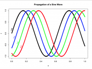
R is a programming language[ref]you can check out the Wikipedia page, but I’d actually jus recommend watching a youtube introduction or something similar instead.[/ref] geared towards statistical applications so it comes standard with a whole range of statistical packages that you can use. These tools alone make R a great asset for anyone who has data that they need to interpret and analyze, but the real reason I, personally, stumbled into R is for the eye candy. With nothing more than a quick google search and a couple lines of code I had a beautiful figure in front of me[ref]While I can’t show off any of the figures I have, here are two that were made with no more than about three lines of code in a total of ~4 minutes.Rplot 
 [/ref]. It was really that easy.
I won’t belabor the point here, and I certainly won’t try to introduce you to R (there are far superior resources available[ref]The site, Coursera, has a free course on how to program in R, and it is awesome![/ref]), but I do hope that you’ll consider checking it out if you have ANY data you need to display or analyze. Just don’t let the idea of ‘coding’ frighten you, it’s really rather straightforward.
3 thoughts on “Learning R”
Comments are closed.