Update 10/13/15 – Minor improvements to code and an update to the latest findings.
CTD data (conductivity, temperature and depth) from a YSI provides a quick and methodologically simple way to estimate the current water column state by, literally, dropping an instrument off the side of a boat. During each deployment the YSI records the water column’s current state providing a nice profile of conductivity and temperature at different depths. Since the cost per profile is so low, you should always take as many as possible and hope to analyze them later when back on land. Here I develop a simple suite to run a cluster analysis in order to find commonalities and trends, therefore helping to find the needle in the haystack.
The first step is to load and organize the data into data.frames within R, a step which I shall not pursue here. For an idea of how the data should be structured consider the first 6 rows in my YSI data.frame:
>> head(data)
	ID	D	T	S	Ch1	ODO1
1	1	0.146	15.84	15.98	0.6	100.6
2	1	0.162	15.87	16.08	0.7	100.8
3	1	0.23	15.93	16.16	0.9	101.1
4	1	0.262	15.95	16.16	0.9	101.2
5	1	0.291	15.96	16.14	1.2	101.3
6	1	0.296	15.96	16.13	1.3	101.4
For each station (or cast) the ID entry increases, and the other columns are Depth, Temperature, Salinity, Chl a and dissolved oxygen.
The first thing we need to decide on is how to compare (i.e. measure) the distance between any two profiles. For my purposes, I want two profiles with similar shapes to be group together, and profiles with dissimilar shapes to be far apart regardless of scale. I’ve decided to scale the Salinity and Temperature values across all measurements to make comparisons between any two of them meaningful (as part of a population).
data[,3:4] = scale(data[,3:4])
Most of my data is restricted to 0-2 metres of depth, but the depth at which each measurement was taken varies, as does the number of samples taken per cast. To remedy both of these issues, I’ve decided on interpolating[1] the data to a prescribed set of depths with a fixed number of bins (i.e. 10).
My distance function is euclidean on S and T, which have been normalized and centered (e.g $Y_i = (Y_i – \bar{Y})/\mu_Y$).
dis = function(x, y) {
    depths.x = seq(0.0, max(x$D), max(x$D)/10.)
    depths.y = seq(0.0, max(y$D), max(y$D)/10.)

    x.S = splinefun(x$D, x$S)(depths.x)
    x.T = splinefun(x$D, x$T)(depths.x)
    y.S = splinefun(y$D, y$S)(depths.y)
    y.T = splinefun(y$D, y$T)(depths.y)

    return(sqrt(sum( {x.S-y.S}^2 + {x.T-y.T}^2 )))
}
This function interpolates depth to 10 levels between $0 m$ and the maximum depth recorded during the cast, and then normalizes them across the casts[2] so that depth does not matter to the distance metric. Depending on the situation, this may more may not be the way to handle the incompatibility in sample number and depths[3].
From here, the creation of the distance matrix is simple.
d = matrix(0, nrow = count, ncol=count)
for(x in 1:count) {
    for( y in 1:x) {
        d1 = data.frame(scale(data[data$ID == x, 2:4], scale=FALSE))
        d2 = data.frame(scale(data[data$ID == y, 2:4], scale=FALSE))
        dd = dis(d1, d2)
        d[x,y] = dd
        d[y,x] = dd
    }
}
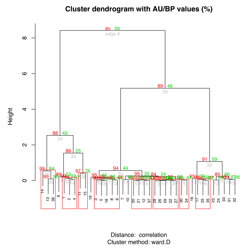
The clustering method I decided on here was a hierarchical algorithm since I wanted to see all the connectivity between the casts (I expect a range of situations from nearly identical to completely different and this method permits such shading).
library(pvclust)
pv.data = pvclust(d, method.dist="cor", method.hclust="ward.D", nboot=1000)

plot(pv.data)
pvrect(pv.data, alpha=0.95)
The pvclust algorithm also bootstraps the clustering to allow estimates of significance, which is a terribly nice addition.
 Looking at some samples of the groupings, here are some quick charts showing cast 2 (blac) and 3 (red). The overall trends and shapes are quite similar.
For comparison here are the same plots of 2 (black) and 9 (red):
When looking in aggregate at the clustering, and by using a synthetic x axis to place grouped profiles together, we get the following profiles for Salinity and Temperature. While the do, in general, appear similar, there are definite, distinct trends in each of the clusters.
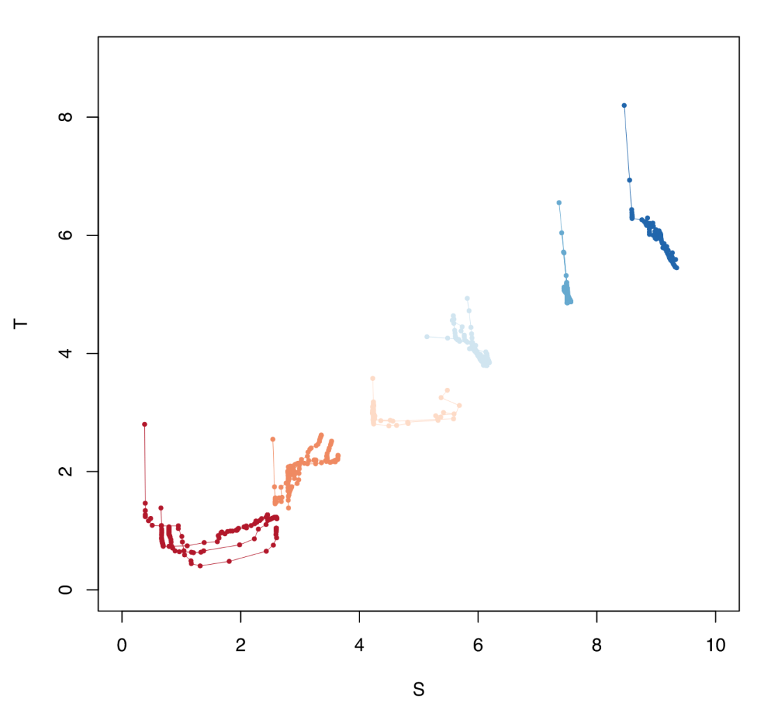
To put the data in the more practical T-S plot, here are the clusters in synthetic relative space. The clusters are pretty compelling when seen here since each group appears distinct.

This was just a quick summary of how to attack data clustering problem. All of this has been rather cursory and primarily for reference (the code is quite ad hoc), but do let me know if anything is unclear or in need of more description/examples.
- Here I use a cubic spline interpolation.
- $D \in [0,1]$
- An alternative to normalizing to depth would be to compare across common depths and ignore points outside this range.


I think it’s a very good approach, I was wondering if that top 0.5m of data could be kept in some way by consolidating “replicates” of “x” at the same “y” due to calibration of the instrument and if such consolidation is fair enough. Anyway, I was curious. Looking forward to more results Tom!
Great question, and the 0.5m cut off is certainly ad hoc. Ultimately the window is limited to between the minimum depth captured and the maximum depth for any given cast so long as we stick to interpolation (not extrapolation) schemes, which I believe is the way to go. Before I’d be comfortable using data up to the minimum depth recorded for each cast, I would like to see how prominent the diel heating signal is since ideally we would like the clusters to account for non-temporal patterns of structure (so far as that is possible).
Much of this might become self-evident once I get all the YSI data from Xu and run the analysis again.